
Virgin Media
Engaging Customers Through Play
Year
2024
CLIENT
VIRGIN MEDIA
SERVICES
UI DESIGN, BRAND, STRATEGY
Virgin Media is one of the UK’s leading telecommunications companies, providing broadband, TV and mobile services. I was brought in to design an experience strategy focused on engaging new customers.
Virgin Media 是英国领先的电信公司之一,提供宽带、TV 和移动通信服务。我参与这个项目,主要负责设计一套以吸引新用户为目标的体验策略。

77% of customers bounce
Virgin Media's main homepage was experiencing a high 77% user bounce rate within the first 5 seconds, negatively impacting online sales. We needed to understand why customers weren’t staying on the site.
77% 的用户直接跳出
Virgin Media 官网首页的 bounce rate 高达 77%,大部分用户在进入网站后的前 5 秒内就离开了,直接影响线上销售。我们需要先弄清楚:为什么用户不愿意留下来?
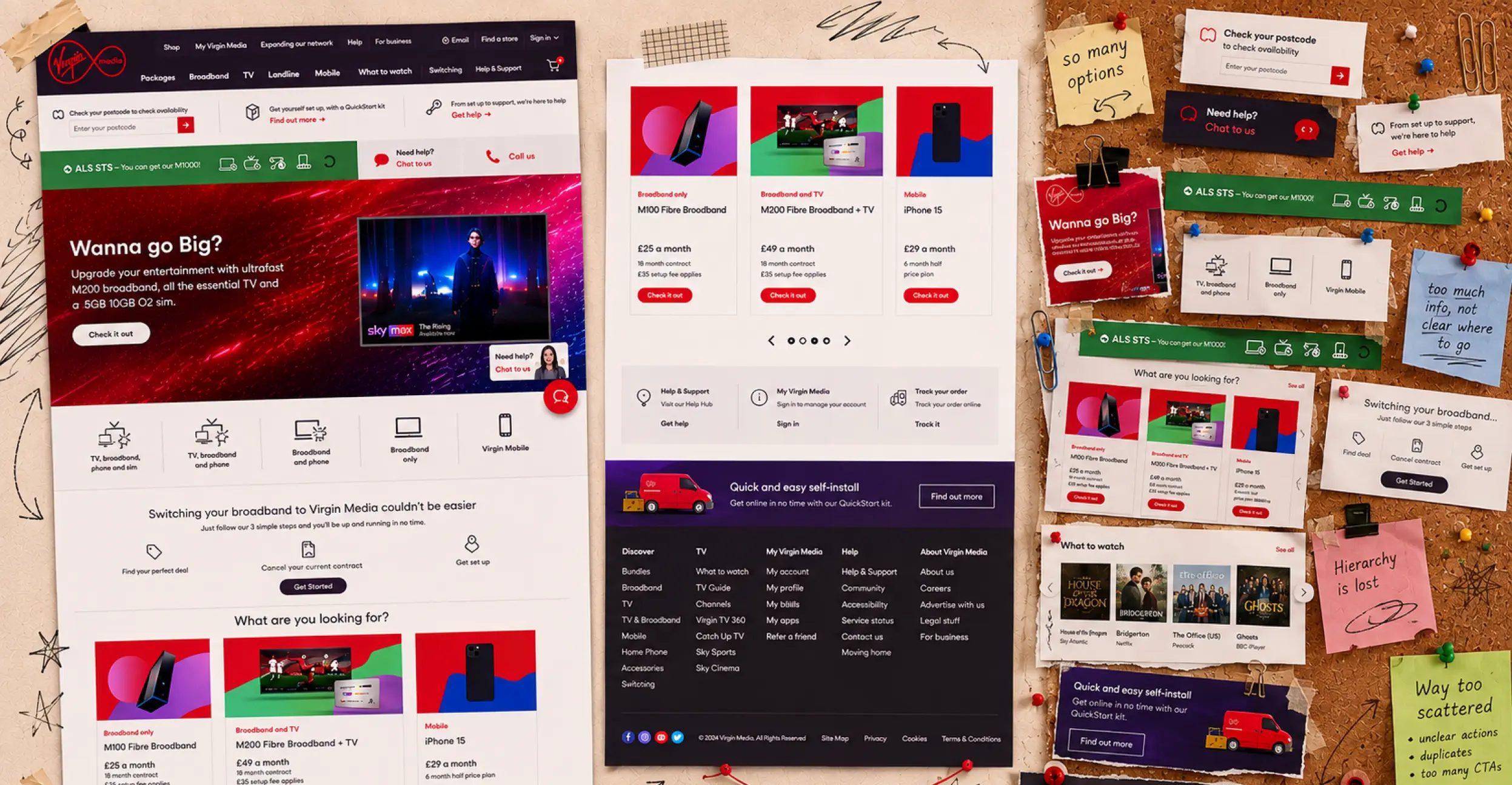
The website is a giant pinboard.
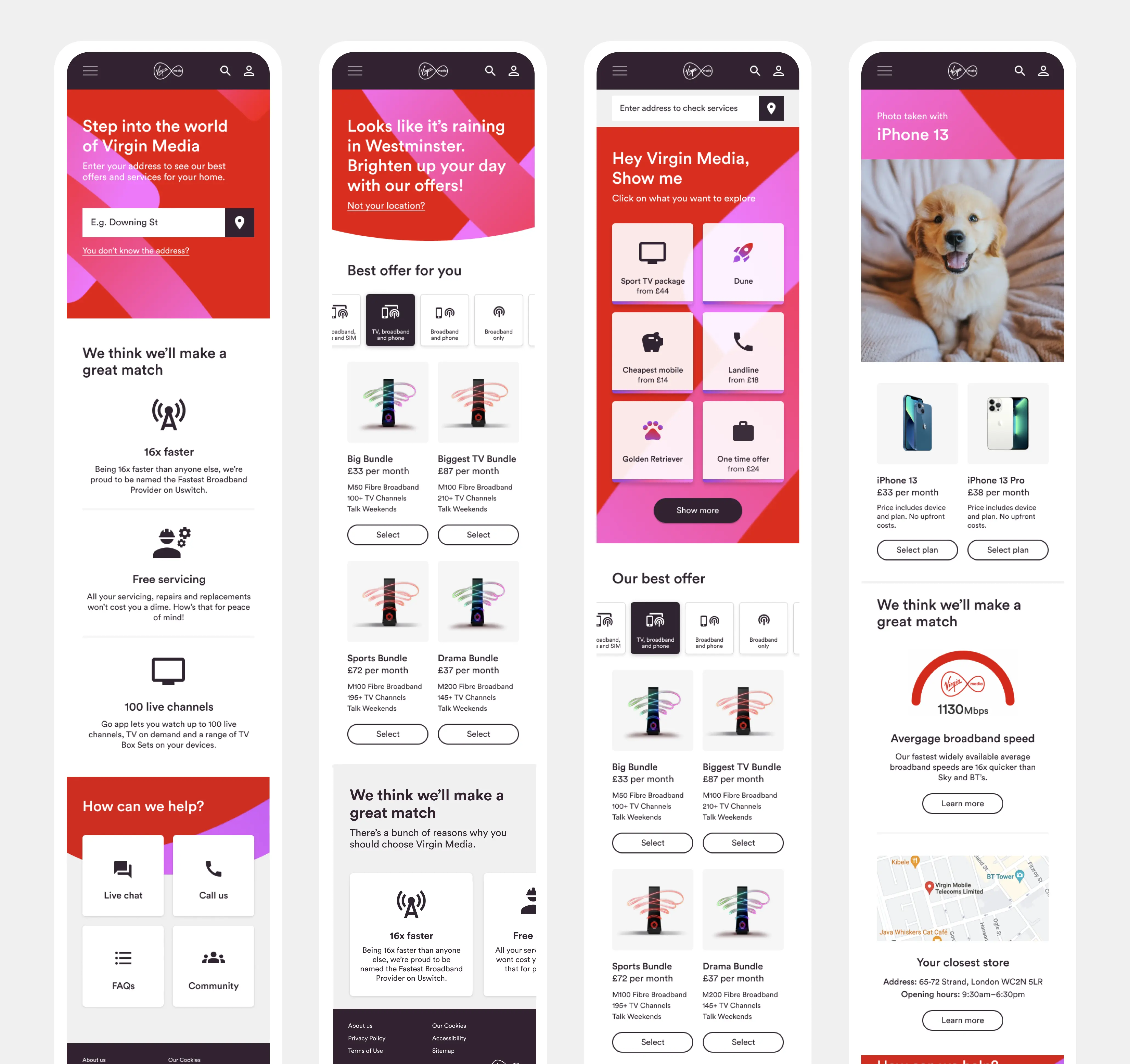
I ran a design audit and found a website trying to do too much at once. Different actions, products and user journeys were scattered across the homepage, often with several ways to do the same thing. The result was an overwhelming experience with no clear hierarchy, making it difficult for customers to know where to go next.
整个网站就像一个巨大的信息板
我先做了一轮 design review,很快发现这个网站想在一个页面里塞太多东西。不同的产品、操作和 user journey 全都散在首页上,同一件事甚至有好几个入口。整个体验没有清晰的层级,信息量又很大,用户自然很难知道下一步该去哪。

Homepage reflects the business, not the customer.
Looking deeper, the problem wasn’t just visual clutter. The homepage reflected Virgin Media’s organisational structure, rather than what customers actually wanted to do. Technical jargon like Gig1 Fibre, M100 and 30GB assumed customers already understood the products, while competing offers and CTAs made it difficult to know what to choose.
首页是按照业务逻辑设计的,而不是用户需求
再深入看,问题不只是页面太乱。整个首页更多是按照 Virgin Media 自己的组织和业务结构来设计,而不是用户真正想做什么。像 Gig1 Fibre、M100、30GB 这样的复杂专业术语,默认用户已经了解这些产品和区别,再加上各种 offer 和 CTA,很难让人快速知道自己到底该选什么。
Users were overwhelmed
Speaking to customers confirmed our assumptions from the design audit. People struggled to understand the products, find what was relevant to them and work out where to go next. With so much competing for their attention, many simply dropped off before reaching purchase.
用户看懵了
跟用户聊过之后,也验证了在 design review 里之前的假设。大家看不懂产品之间的区别,也很难找到跟自己真正相关的内容,更不知道下一步该点哪里。页面上的信息和选择太多,很多用户还没走到购买环节就直接流失了。


We needed to build a structure based on user needs
To make the website easier to navigate, we needed to rethink its structure around what customers were actually trying to do. I mapped our research findings across the team to build a logical information hierarchy based on user needs, rather than Virgin Media’s organisational structure. It also became a useful tool for aligning stakeholders around customer expectations.
重新按照用户需求搭建网站结构
要让网站更好用,首先要重新梳理整个信息架构,围绕用户真正想做的事情来设计。结合 research 的发现,把不同的用户需求重新梳理和归类,建立一套更有逻辑、以用户需求为核心的信息架构,而不是继续沿用 Virgin Media 原本的组织架构。这套结构也成为了一个很好用的沟通工具,帮助不同团队对用户的需求和预期达成共识。
To go one step further, personalise the journey
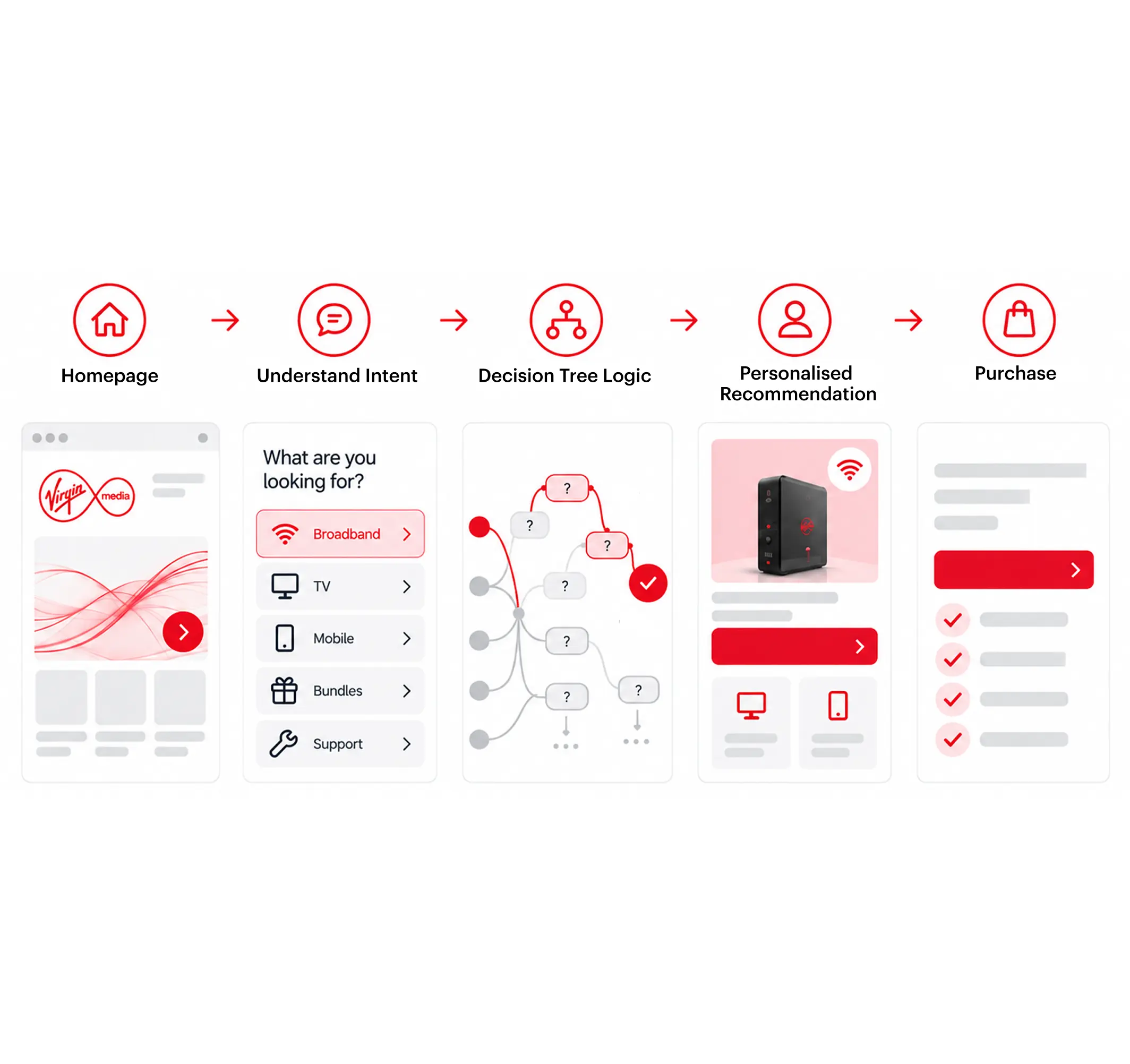
Once we had a clearer structure, we could go one step further. What if the experience could understand each customer’s intent and guide them towards the most relevant products? I started designing a personalised journey from understanding intent, through decision logic and recommendations, all the way to purchase.
再进一步,把用户旅程做得更个性化
有了更清晰的结构之后,还可以再往前走一步:如果网站能理解每个用户的意图,再根据他们的需求推荐最相关的产品呢?于是开始设计一条个性化用户旅程,从理解用户意图、决策逻辑到产品推荐,最后一路引导到购买。
But how do we know what customers really want?
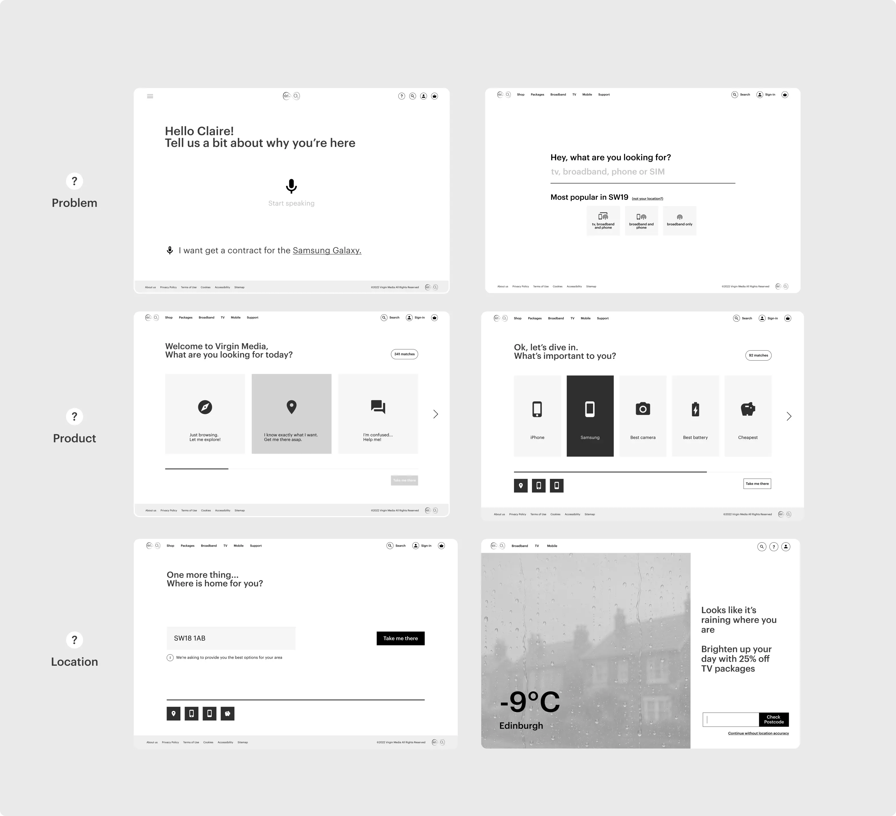
I started exploring interactive ways to understand customer intent by simply asking what they were looking for. Early concepts included quick questions, guided product selection and even an AI conversational agent that could learn over time and make personalised recommendations.
但怎么知道用户真正想要什么?
接下来就是:怎么知道用户真正想要什么?我开始尝试一些更有互动感的方式,直接问用户在找什么。早期方案包括快速问答、一步步引导选产品,甚至还有一个 AI conversational agent,可以慢慢了解用户,再给出个性化推荐。

Learning what they like through play
Over time, I pushed these ideas towards something more playful. Instead of simply asking customers what they wanted, I explored interactions that could learn from what they chose, turning personalisation into a more engaging experience and helping customers discover relevant products earlier.
用玩的方式了解用户喜欢什么
后来,我开始把这些想法做得更有趣、更有互动感。与其直接问用户想要什么,不如让他们边玩边选,再从这些选择里慢慢了解他们的偏好。这样,个性化本身也变成了体验的一部分,同时能更早帮用户找到真正相关的产品。
Turning ideas into interactions
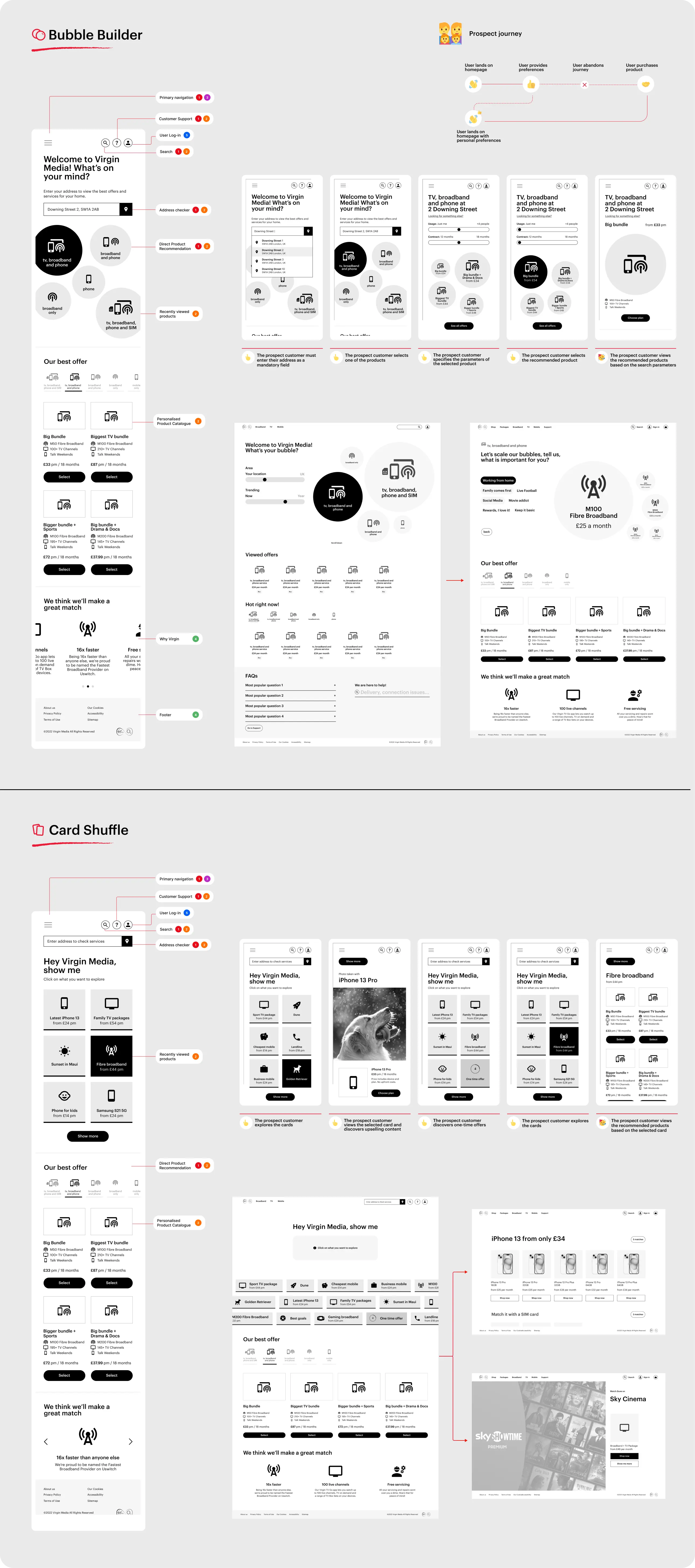
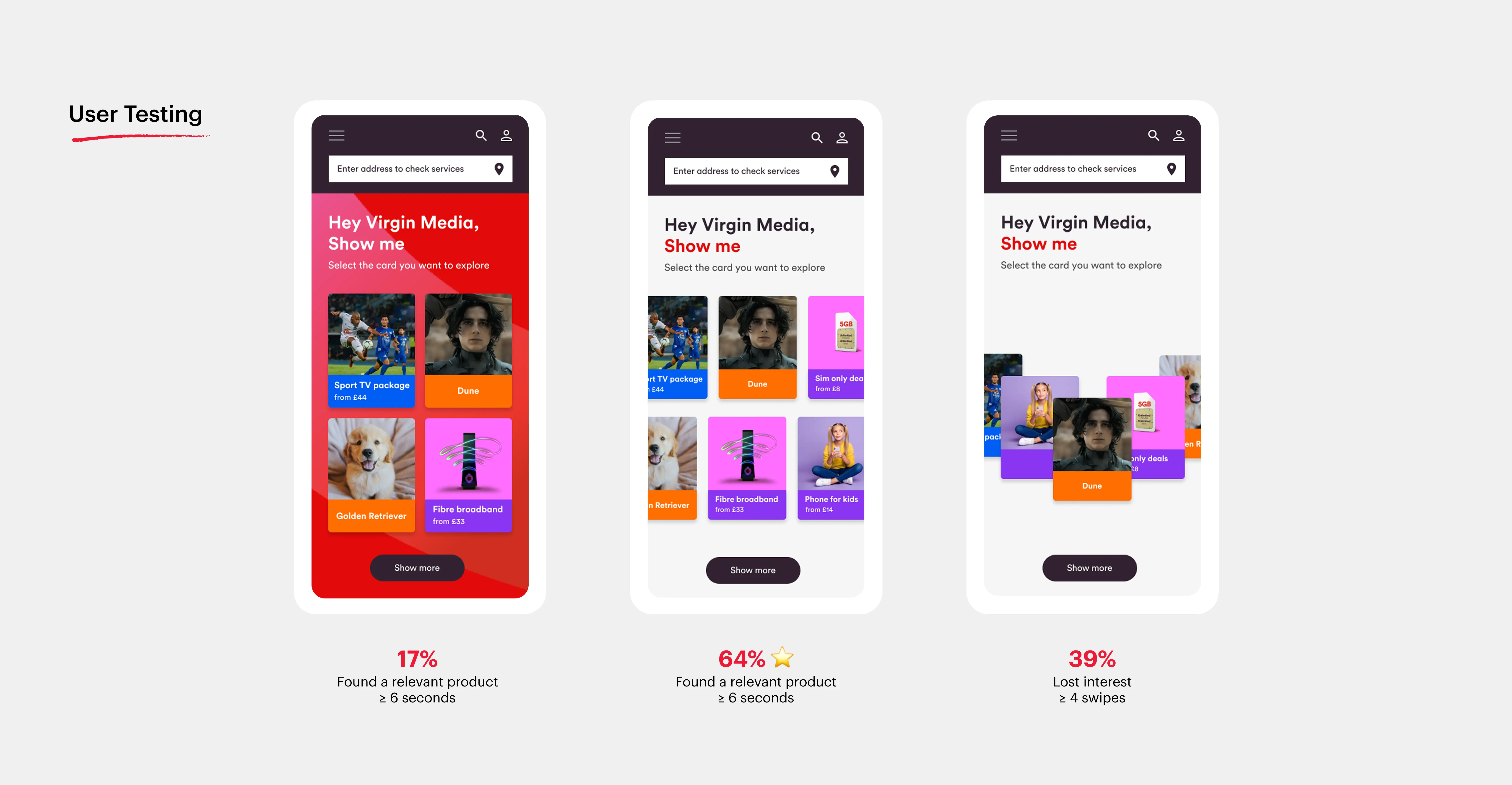
I developed two directions through rapid wireframing, exploring how customers could express their preferences through simple, playful interactions. Bubble Builder used selections to progressively shape recommendations, while Card Shuffle let customers browse and react to different interests and products.
把想法变成真正的互动
通过快速 wireframing,我把前面的想法发展成两个不同方向,看看怎么用简单、有趣的互动让用户表达自己的偏好。Bubble Builder 会根据用户的选择一步步调整推荐内容,而 Card Shuffle 则让用户通过浏览和选择不同的兴趣和产品,慢慢找到更适合自己的内容。
Testing and refining on mobile
I tested the prototypes with users, iterating on the journey and visual design. With each iteration, I focused on how quickly customers could find something relevant, while keeping the experience playful and easy to navigate.
在 Mobile 上边测边优化
我开始用 prototypes 和用户一起测试,不断调整整个用户旅程和视觉设计。每一轮迭代,我都重点关注用户能不能更快找到跟自己相关的产品,同时保持体验简单、有趣、好逛。

Refining the experience for web
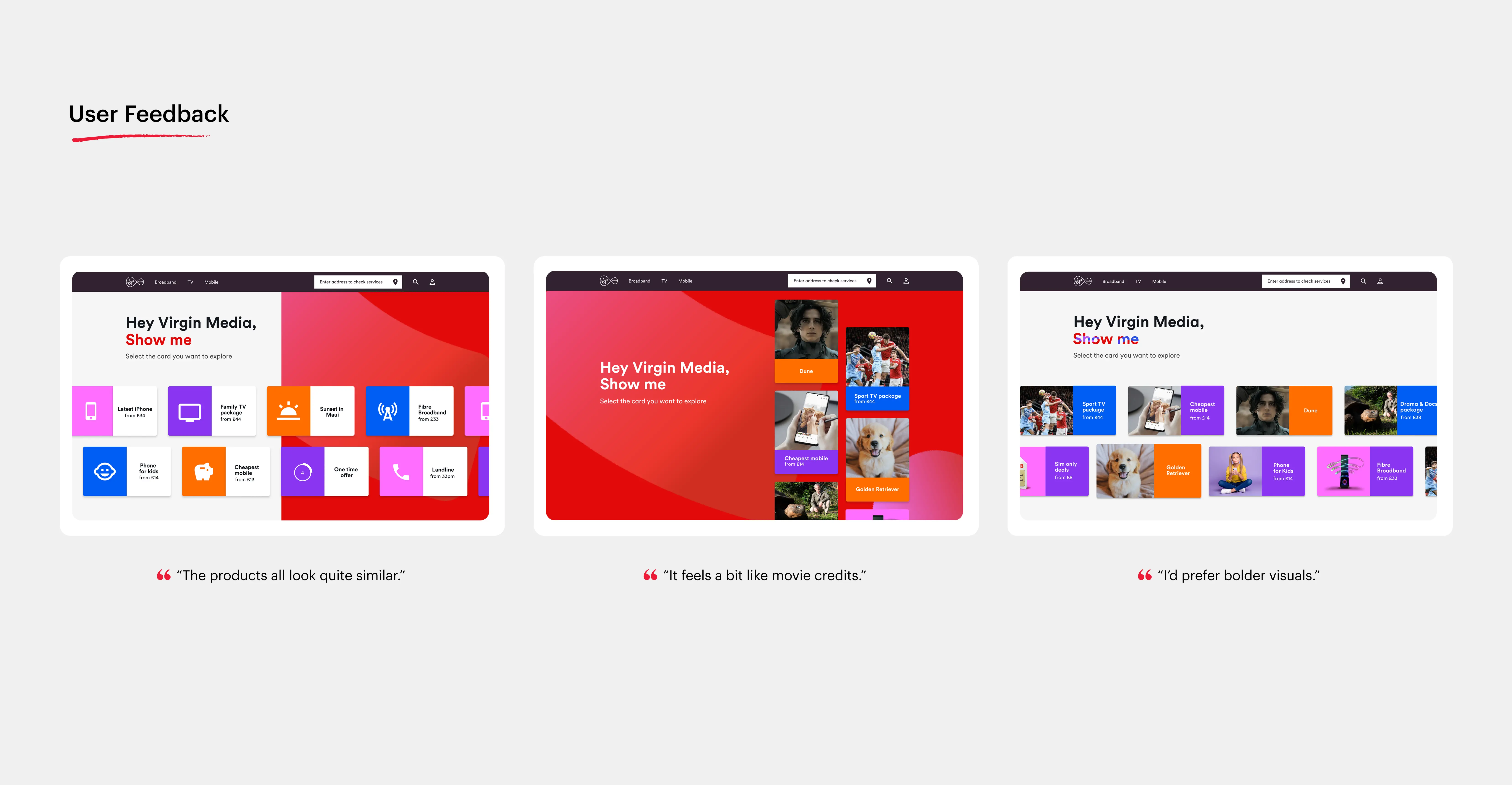
Web was particularly important, as many British customers still browse and compare broadband and mobile products on desktop. I explored how the experience could make better use of the larger canvas, using customer feedback to refine the layout, visual hierarchy and product discovery experience.
继续优化 Web 体验
Web 也非常重要,因为很多英国用户还是习惯在 Web 上浏览和比较宽带、手机等产品。利用更大的屏幕空间,我继续优化页面布局、视觉层级和产品发现体验,并结合用户反馈不断调整。


Now, customers stay and play
The new experience delivered:
22% reduction in bounce rate, helping more UK customers stay and explore.
Data intelligence, capturing customer preferences through play, with every click.
Campaign-ready flexibility, with a modular interface that allows the business to quickly adapt the experience for seasonal campaigns, ads and special offers.
Smarter personalisation, using customer data to understand intent and display more relevant products.
现在,用户愿意留下来玩了
新的体验带来了:
跳出率降低 22%,让更多英国用户愿意留下来继续逛。
数据智能,通过游戏化互动,在每一次点击中持续捕捉用户偏好。
灵活支持 Campaign,通过模块化界面,让业务可以快速适配不同的季节性 campaign、广告投放和优惠活动。
更智能的个性化推荐,利用用户数据理解用户意图,展示更相关的产品。

That's a wrap
Thanks for reading