
Virgin
Engaging Customers Through Play
Year
2024
CLIENT
VIRGIN MEDIA
SERVICES
UI DESIGN, BRAND, STRATEGY
Virgin Media is a leading telecommunications company in the UK, providing high-speed internet, TV and mobile phone plans. My role was to design an experience strategy to engage new customers.
Virgin Media 是英国知名通信企业,主营高速网络、电视及移动通讯服务。我当时负责设计用户体验策略,以此吸引新用户。

77% of customers bounce
Virgin Media's main homepage was experiencing 77% user bounce rate within the first 4 seconds, negatively impacting online revenue.
The website is a giant pinboard.
I did a design audit and discovered the business lines were scattered, user actions unclear, different actions scattered around the page. For users the poor information hierarchy meant lots of effort was needed to navigate.
1,000 country lanes
A complex, overlapping network of starting points
Several ways to do the same thing
Too many routes to progress - paradox of choice?
Likely that over 50% of the page isn’t relevant to the user
So what?
Tough to understand user intention
Splitting the conversion opportunties
Brand association. VM = complex
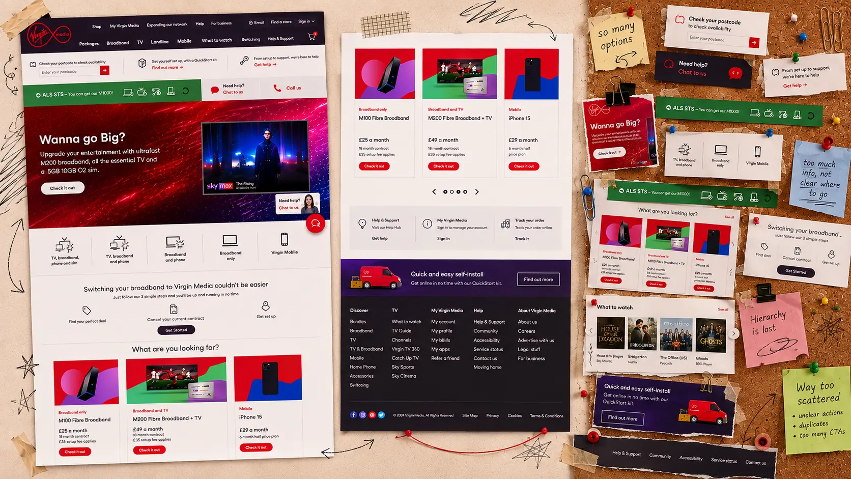

Homepage reflects the business, not the customer.
Most customers didnt know the difference between Gig1 Fibre and Gigabit broadband. The site was divided into business departments instead of packages
img overlay: I just want to buy wifi
Simply put from analysing the quantitative browsing data and qualitative user research, I concluded the (root cause) homepage was driven by organisational hierarchy and internal jargon that did not resonate with Virgin customers.
Minutes & GBs before
customer needs
Zooming on selling the commodity, not the service
Continue to reiterate a message of commodity bundles
Complex for the uninitiated to engage - it’s about learning
The CTAs that are more problem oriented are missing focus
So what?
Missing the opportunity to understand real customer needs
Missing the opportunity for serendipitous up/cross sell
Reinforces a race to the bottom amongst competitors
Users were overwhelmed
Speaking to users confirmed our design assumptions that navigation and cluttered UI were causing users to get overwhelmed and abandon the transaction.


We needed to build a structure based on user needs
The only way to make the website easier to navigate was to build an informational hierarchy and logical structured based strictly on user needs in that moment. I mapped this out/shared across team, it was also helpful communication tool to the client for them to understand what customers expect/are looking for.

One step further, think about personalising the journey
This was a start, but we needed to classify customers individually understand what they want and funnel them on that personalised journey (flow ux strategy, questions, decision tree logic?) AI?
How do we learn what customers want?
Started to ideate ways to ask customers what they're looking for so we could show the best products. I created quick mock-ups to test early concepts. This included a friendly AI conversational agent that could learn over time and make recommendations. (img brainstom ideas)
Learning what they like through play
We learn much more through play. I pivoted to a more interactive strategy, engaging with customers in a playful way to show them the right products earlier.
Concept development
(stack wireframes) starting to think about the journey
Test, Learn, Iterate, Repeat
(wireframes)
Refinements
(colour images)
Now, customers stay and play
By capturing intent through playful interactions, we gained valuable insights into customer wants and needs, enabling us to enhance product personalization and boost engagement metric (final image)
That's a wrap
Thanks for reading